Wes Anderson’s films hit you with a very specific, unmistakable color vibe: dreamy pastels, warmth, and cozy nostalgia. That’s color grading working its magic. And no, it’s not just for Hollywood. Even your favorite content creators are using color grading to make their videos more powerful. So if you’re asking what is color grading and want to learn how to create your signature style, you’re in the right place.
This beginner’s guide will walk you through every aspect of color grading, and by the time you are done reading, you’ll have a clear understanding of how to use it to improve your videos and avoid potential mistakes.
Table of Contents
– What is Color Grading
– Color Grading for Social Media and Films
– The Main Principles of Color Grading
– Most Common Color Grading Styles
– The Emotional Impact of Colors
– Color Grading Tips to Avoid Mistakes
– Using AI to Color Grade Videos
– Edit Your Video with Podcastle
Listen to this article
What is Color Grading?
Color grading is the art of giving your video its final “look.” It’s where mood, emotion, and style come to life through color. It’s like adding a filter to a photo, but with a lot more control. Color grading is how you shape the visual tone of your story, if you’re aiming for warm and nostalgic or maybe cool and cinematic vibes.
Now, to clear up a common confusion: color grading isn’t the same as color correction. Color correction comes first; it’s all about fixing things. Maybe your footage looks too blue, or the lighting wasn’t quite right. Correction brings everything back to a natural, balanced state.
Color grading, on the other hand, is where creativity kicks in. It’s less about fixing and more about enhancing. After the colors are corrected, grading lets you push them further to craft a distinctive visual feel that fits your project’s vibe.
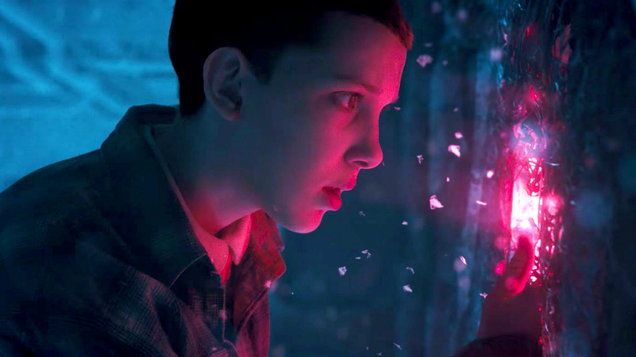
Take the “Stranger Things” show, for instance; that eerie, red-and-blue neon glow has become an inseparable part of the show, and it’s a deliberate grading choice that instantly sets a retro, supernatural tone.
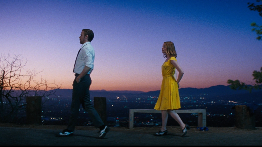
Similarly, in “La La Land,” the grading leans into golden, dreamy purple hues to give it a magical, romantic feel.
Music videos have adopted this, too: Billie Eilish’s videos often use cool, muted colors to match her melancholic style, while Dua Lipa videos usually pop with vibrant pinks and purples to match a dance-pop vibe.
Professional footage is not the only place where you will notice color grading; it’s a thing on social media, too. On Instagram, for instance, you'll often see beauty reels with soft pastel tones or moody desaturated fan edits of famous movies and characters (all Draco Malfoy edits, for example).
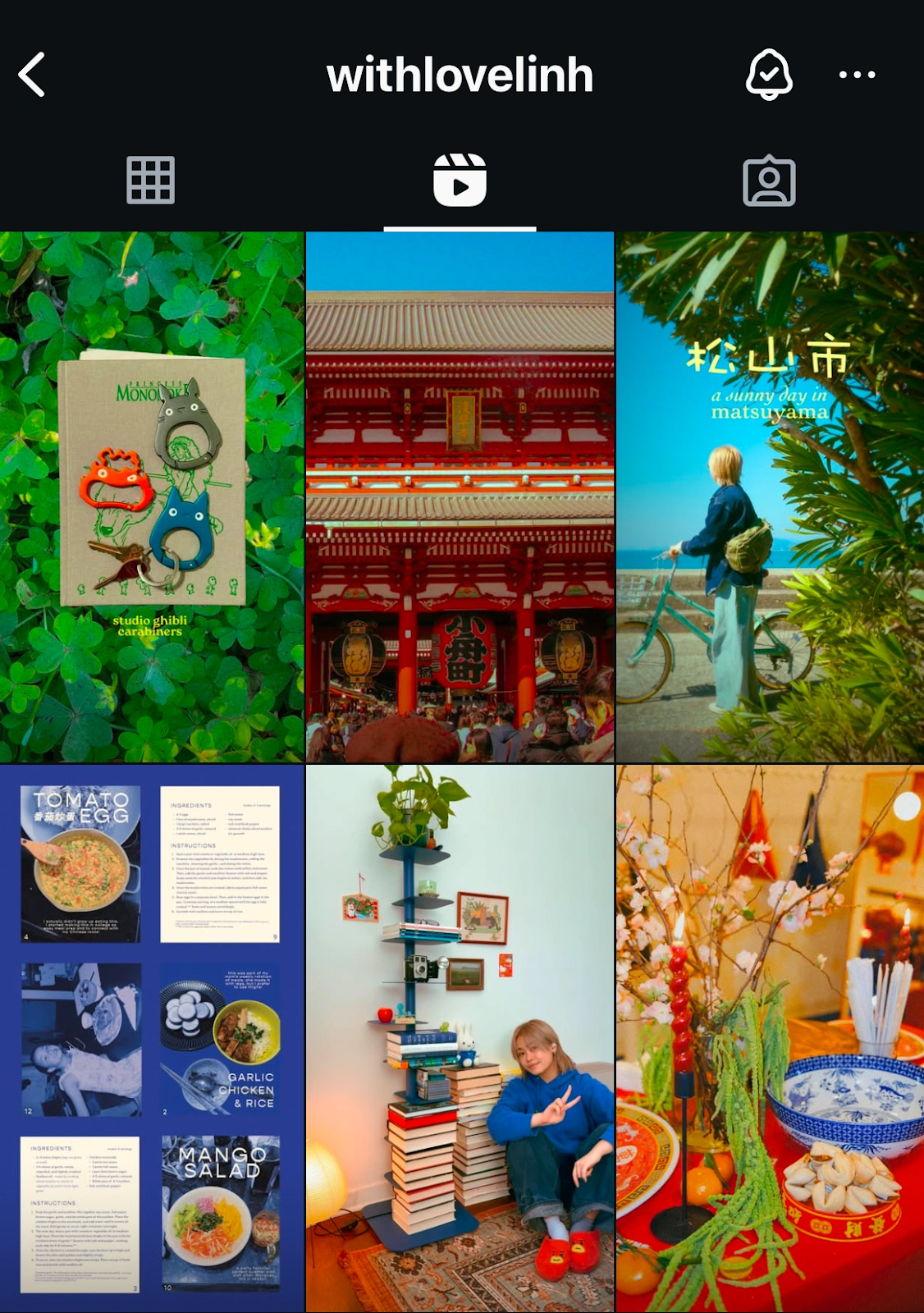
Some influencers often express the aesthetics of their socials through color grading, sharing reels and photos in color palettes that have become their signature style.
In short, color correction fixes the footage, while color grading stylizes it. Together, they make your video look polished, professional, and visually unforgettable.
Color Grading for Social Media and Films
Color grading helps shape how viewers feel about your video. It’s used in films, vlogs, brand reels, webinars, and podcasts to create a mood and guide emotion. Every color choice, from shadows to highlights, affects how the content is perceived.
How Color Grading Is Used in Films
In film, color grading is detailed and precise. It’s handled by experts using professional software and calibrated monitors. The goal is to create a consistent visual mood across a long story. Think of how warm tones add nostalgia in a film like Call Me by Your Name — every color supports the emotion.
Color Grading for Social Media Videos
On TikTok, Instagram, and YouTube, grading is faster and more expressive. It helps grab attention in the first second and reflect the creator’s personality. Warm tones might signal a cozy morning vlog, while cool blues hint at a moody night routine. Bright colors and high contrast often highlight dancing, food, or product content.
Mobile-First Color Grading Techniques
Social media grading focuses on phones, small screens, and bright environments. Creators use LUTs (Look-Up Tables) and mobile apps to build consistent, recognizable looks. It’s less about perfect color accuracy and more about energy, vibe, and speed.
Color Grading Makes Webinars Look More Professional
Even webinars and talking-head videos benefit. Neutral backgrounds, clean skin tones, and good lighting can make content feel more polished and trustworthy without being overly edited.
Color Grading Goals Across Platforms
No matter the format, color grading supports mood and message. In film, it strengthens the narrative. On social media, it sells the moment. But in both, it turns average footage into something memorable.
The Main Principles of Color Grading
Color grading might seem like magic, but behind the cinematic vibes and dreamy or trendy filters are a few solid principles that guide the process. Whether you’re editing a short film, a YouTube vlog, an Instagram Reel, or a TikTok video, these are the core ideas that help turn raw footage into something visually stunning.
- Contrast and Exposure: This is where your image gets its depth. Good contrast makes your visuals pop by balancing the brights and darks. It helps define shape, space, and emotion, like making a sunrise feel soft and hopeful, or a dark alley feel tense and gritty.
- Color Balance: Ever seen a video where the whites look weirdly blue or orange? That’s a color balance issue. Keeping your whites white and your skin tones natural is essential before you start getting creative. It sets the foundation for everything else.
- Saturation: This controls how bold or muted your colors look. You can go bright and punchy for high-energy content, or more desaturated for a subtle, emotional tone. Think of it like volume for your colors, how loud do you want them to be?
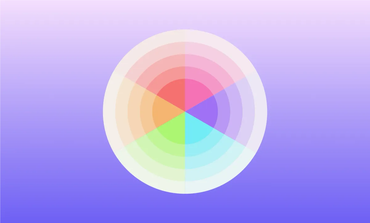
- Color Harmony: Here, art meets science. Using color theory, like complementary or analogous color schemes, you can create visuals that just feel right. A teal and orange combo, for example, is a Hollywood favorite for a reason: it creates beautiful contrast while keeping skin tones flattering.
- Consistency: One of the biggest rookie mistakes is when every shot looks different. Consistency means making sure your whole video feels unified, even if scenes are shot at different times or locations. It helps keep viewers immersed in the story.
- Mood and Emotion: At its heart, color grading is storytelling through color. Want your scene to feel nostalgic? Go for warm, faded tones. Want it cold and suspenseful? Try cool blues and shadows. The right grade can completely shift how your audience feels without changing a single word.
- Focus on the Subject: Grading can help guide the viewer’s eye. By darkening backgrounds or enhancing skin tones, you subtly highlight what matters most in the frame, which is your subject. It’s like visual direction without needing to point.
Most Common Color Grading Styles
Color grading isn’t a general concept; it’s very much individual for every creator. However, different styles can completely change how your video feels, even if nothing else changes. Here are some of the most popular color grading styles you’ll see across movies, music videos, social media, and YouTube content:
1. Teal and Orange: The Hollywood Favorite
This color grading is everywhere in films, for example, “Mad Max: Fury Road” or “Transformers”. Why does it work so well? Skin tones naturally fall into warm hues (orange), and teal sits on the opposite side of the color wheel, making backgrounds pop. It creates energy, contrast, and that cinematic “wow” factor without overwhelming the viewer.
2. Warm and Nostalgic
Dreamy golden hues, soft shadows, and slightly faded blacks… this look feels like flipping through an old photo album. You’ll often see it in indie films, travel vlogs, or romantic reels. On Instagram, it’s a go-to for creators aiming for cozy or sentimental vibes. In filmography, a great example of this color grading is “Little Women”, the 2019 version, where warm, sun-drenched palettes capture the softness of memory and family.
3. Cool and Desaturated
This one includes blue tones, muted saturation, and moody shadows. Which is considered the formula for a cold, dramatic tone. This is big in thrillers, sci-fi, and edgy music videos. In Batman (2022), almost every frame in this movie leans heavily into cool blues, grays, and muted shadows. This makes Gotham feel cold, wet, and haunted. The desaturated palette adds weight to the tone; everything feels serious, tense, and emotionally distant.
4. High Contrast and Vibrant Colors
Perfect for content that’s fun, fast-paced, or made to grab attention. Think pop music videos, fashion reels, or anything aimed at younger audiences. Bright reds, bold yellows, deep blacks, everything pops. YouTube creators often use this to keep energy high and visuals punchy. A perfect example of this color grading is the whole Barbie movie. Just look at all the colors it includes at their brightest.
5. Black and White / Monochrome
Stripping away color might seem like the opposite of grading, but it’s a style in itself. Black and white can make a scene feel timeless, serious, or artistic. It draws attention to shape, emotion, and contrast. Beyoncé’s “Single Ladies” or movies like “Roma” prove how powerful this look can be when used intentionally. In “Single Ladies,” the black-and-white grade puts full focus on the choreography, and every movement becomes more dramatic, more iconic. In “Roma,” the lack of color heightens the emotional weight of each scene, making everyday moments feel epic and deeply human.
On social media, this style is often used in emotional edits, slow-motion clips, or monologue-style content.
6. Natural and Clean
Not every project needs dramatic grading. A soft, natural grade that enhances skin tones, evens out lighting, and keeps colors true-to-life is often the best choice, especially for interviews, tutorials, YouTube and social media videos, or professional content. If you are not trying to make a statement with color and are just helping the visuals look polished, this is the color grading you need.
The Emotional Impact of Colors
Color psychology has long been considered a reliable indicator when it comes to understanding emotions, mood, and behavior, and it is just as useful in color grading. Here is a complete rundown of how color triggers emotion in videos.
How Warm Colors Affect Mood
Reds, oranges, and yellows create feelings of warmth, comfort, and energy.
A golden-hour vlog can feel nostalgic and friendly, while a bold red overlay might suggest urgency or excitement. But too much red, especially in fast-paced edits, can cause stress or feel aggressive.
How Cool Colors Shape Tone
Blues, teals, and purples are often used to make content feel calm, professional, or reflective.
Tech channels, wellness content, and productivity videos rely heavily on these colors to signal focus and reduce viewer anxiety. These tones are known to lower heart rate and make content feel clean and modern.
When to Use Green in Color Grading
Green is tricky. It can represent freshness or nature, but when paired with shadows, it often feels eerie or tense.
Filmmakers use this to create unease or hint at emotional complexity, especially in dramatic scenes or thrillers.
How Neutral Colors Communicate Style
White, gray, and black carry strong visual signals.
White backgrounds look clean and professional, ideal for webinars, interviews, and explainer videos.
Black or grayscale grading is popular in luxury ads, dramatic monologues, and introspective content where seriousness or elegance is key.
Scientific Proof That Color Affects Emotion
Understanding the emotional role of color isn’t just a matter of taste; it’s backed by science. Studies have shown that:
- Green helps reduce anxiety and improve focus.
- Yellow boosts energy and alertness, but can cause unease in large amounts.
- Blue lowers heart rate and is even used in urban lighting to reduce crime and calm the public.
Why Creators Should Use Color as a Tool
For creators, brands, or filmmakers, this means color isn't just a finishing touch; it's a storytelling tool. Whether you're editing a feature-length film or a 30-second Instagram reel, color grading allows you to guide your viewers’ emotions and deepen their connection to your content.
Color Grading Tips to Avoid Mistakes
As you start your color grading experience, a lot can go sideways and very fast. One wrong move, and your video goes from cinematic to chaotic. The good news? Most mistakes are totally avoidable. And here are some tips to help you do that!
1. Always Color Correct Before You Grade
Before adding mood or style, fix the technical issues, adjust white balance, exposure, and contrast to create a clean, neutral base. If the lighting was off when you shot your footage, color grading won’t magically fix it. Without this foundational step, grading can make flaws more visible and harder to control later.
2. Don’t Fall Into the “Over-Grade” Trap
Saturation and contrast sliders are tempting, but pushing them too far can make footage look garish, noisy, or flat-out unrealistic. Think of color grading as seasoning a dish: a light touch enhances, but too much overwhelms. Unless you’re going for a highly stylized look, subtle adjustments often yield the most professional results.
3. Use LUTs as Tools, Not Crutches
LUTs (Look-Up Tables) are popular because they speed up the grading process, but they’re not a one-click solution. A LUT might be designed for footage with totally different lighting, exposure, or camera settings than yours. Apply LUTs gently and always fine-tune with manual adjustments to make the grade feel authentic to your footage.
4. Watch the Skin Tones Closely
No matter the vibe you're after, natural-looking skin tones are non-negotiable. Skin is where viewers unconsciously notice grading mistakes first. If faces look orange, gray, or off-tone, the whole video can feel wrong. Use skin tone lines on vectorscopes and grade around them to maintain realism while still applying your style elsewhere.
5. Don’t Grade for Your Screen Alone
A video designed for mobile-first viewing (like TikTok, Reels, or YouTube Shorts) needs to pop even on small screens in bright environments. That means slightly higher contrast, cleaner highlights, and well-defined midtones. On the other hand, long-form YouTube videos or cinematic shorts watched on desktop or TV allow for more subtle, filmic grading. Test your graded video on multiple devices, especially mobile, where most social media viewers watch.
Using AI to Color Grade Videos
Years ago, it wouldn’t even cross our minds that we could upload raw footage and, within seconds, watch it transform. Colors turn more vibrant, tones more balanced, and the mood just right, all without touching a single grading curve. That’s the power of AI in video editing today.
AI color grading tools like DaVinci Resolve’s Neural Engine and Adobe Premiere Pro’s Auto Color are making what used to be a complex, technical process incredibly accessible. These tools analyze your video and automatically apply adjustments to exposure, contrast, white balance, and even style, saving hours of manual work.
For beginner creators and filmmakers, it’s like the answer to all their wishes. You don’t need to understand color wheels or LUTs to make your videos look polished and professional. AI gives you a creative shortcut, letting you focus more on storytelling and less on the technical heavy lifting.
Edit Your Video with Podcastle
Once your footage is color graded and visually polished, it’s time to bring the entire production together by editing your video, and Podcastle makes that part effortless. With a powerful set of AI tools built for beginner and pro creators, you can improve every element of your video without needing a professional editing background.
Want your voice to sound even perfect, just like a studio recording? Try the AI Audio Enhancer, which sharpens clarity and automatically gives you the best possible version of your voiceover, or the instant resizer to get the perfect aspect ratio for your videos.
Forgot to record in high-res? Video Enhancer uses AI to sharpen and upscale your footage instantly, and easily fix your eye contact in the video with just a click.
Regardless of whether you're editing a vlog, tutorial, podcast episode, or a short movie, Podcastle gives you smart, intuitive tools to polish your content faster, easier, and with a professional finish.