Just like a book cover tells a story, the little picture you put as your podcast cover gives your audience a sneak peek into the awesome audio adventures waiting for them. They're like the face of your podcast, showing you what it's all about. But there's more to it than meets the eye!
Let's dive into the world of podcast cover art and uncover how colors, AI pictures, and words work together to make podcasts even more exciting. Get ready to explore how to make your own eye-catching cover art and make your podcast stand out in the crowd.
Why is Podcast Cover Art Important for Podcast Listeners?
Podcast cover art is a crucial visual representation of a podcast that appears on various podcast directories, platforms, and social media. It serves as the first point of contact with potential listeners and plays a significant role in attracting their attention. Essentially, podcast cover art is the "face" of a podcast, and it encapsulates the essence of the show, giving listeners an idea of what to expect in terms of content, tone, and style.
The importance of podcast cover art cannot be overstated, as it serves several key functions that contribute to the success and visibility of a podcast:
Capturing Attention: With thousands of podcasts available, standing out from the crowd is essential. An eye-catching and well-designed cover art can make a podcast pop amidst a sea of other shows, enticing potential listeners to explore further.
Brand Identity: Just like logos do for businesses, podcast cover art helps in establishing a strong brand identity for the podcast. Consistent branding across episodes and seasons helps listeners recognize the podcast quickly, building trust and loyalty.
Conveying Content and Genre: An effective cover art should give listeners an instant understanding of the podcast's content and genre. Whether it's a comedy show, a true crime series, or an educational program, the artwork should visually communicate the essence of the podcast.
Professionalism and Credibility: High-quality cover art reflects the professionalism of the podcast and its creators. A well-designed cover suggests that the content is also likely to be of high quality and worth listening to, encouraging potential listeners to give it a chance.
Marketing and Promotion: When shared on social media, podcast directories, or other platforms, the cover art acts as a promotional tool. It can be used to generate interest, create intrigue, and encourage sharing among the audience.
Ease of Recognition: A distinctive cover art makes a podcast easily recognizable, helping listeners remember and recommend it to others. This word-of-mouth promotion is invaluable for expanding the podcast's audience.
User Experience: In podcasting apps, the cover art is often the visual representation of an episode. It improves the overall user experience, making it more engaging and visually appealing.
Best Podcast Artwork Examples
1) The Book Review

The New York Times’ The Book Review is a perfect example of how you can use colors to create a balanced and eye-catching design with various focal points and correct combination of colors.
Color has a pivotal role in your podcast cover art. But if you’re new to it, it can be a challenge to understand how to beautifully combine multiple colors. It’s not always easy to come up with the right color combinations, and more often than not, you might find yourself staring at your cover, thinking about how it ends up looking so amateur.
So to play it safe, we suggest always having the color wheel at hand. One of the ways you can use the wheel is by choosing the colors right next to each other on it, otherwise known as analogous colors.
2) The Start

Another great example of a good color application is The Guardian’s The Start. This cover art is about wisely using the color psychology that we talked about earlier. The yellow here conveys a warm and happy feeling, while the blue builds trust.
The Start also paints a mental picture of sunrise in the viewers’ mind, which certainly goes along with the podcast’s concept, which is to reveal the first works of famous artists and how those works helped to shape their careers.
Overall, the podcast cover art does a great job of leading your gaze toward the logo, combining various colors, and at the same time, while still allowing each color to stand out on its own.
3) Worth Noting
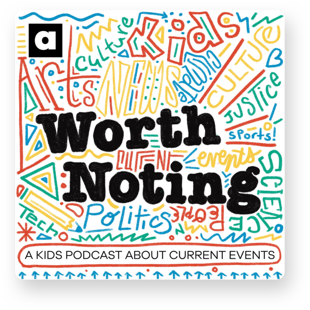
Another colorful cover art on our list is the artwork of Worth Nothing. Worth Nothing is a kid’s podcast about the news, and it allows its content to be at the center of the artwork’s concept. Even if you’re not familiar with the podcast, just by looking at the cover art, you can understand its genre and what it’s going to be about.
Not to mention, of course, the actual keywords written all over the cover and the actual line on the bottom, telling that it is “ A kid’s podcast about current events.” But the best part is that even with all of this, the podcast art manages to stay cohesive and organized.
4) Still Watching
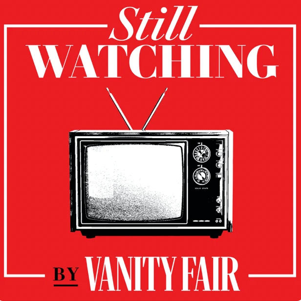
The next podcast cover on our list is the one of the Still Watching podcast, which is also designed with the podcast’s content at the center of the show. The hosts, Joanna Robinson and Richard Lawson, talk about the newest and most popular TV shows that everyone's into. To match the content, they chose a picture of an old TV for the cover. It's like a sneak peek of what the podcast is all about - TV shows!
The utilization of the television symbol in the cover art serves as a visual shorthand, encapsulating the essence of the podcast in a single glance. This choice not only helps attract the target audience who are interested in the podcast's main theme but also creates a sense of recognition and familiarity.
The TV icon evokes feelings of nostalgia and anticipation, reminding the audience of the shared experience of consuming television content.
5) Poetry Foundation Podcasts
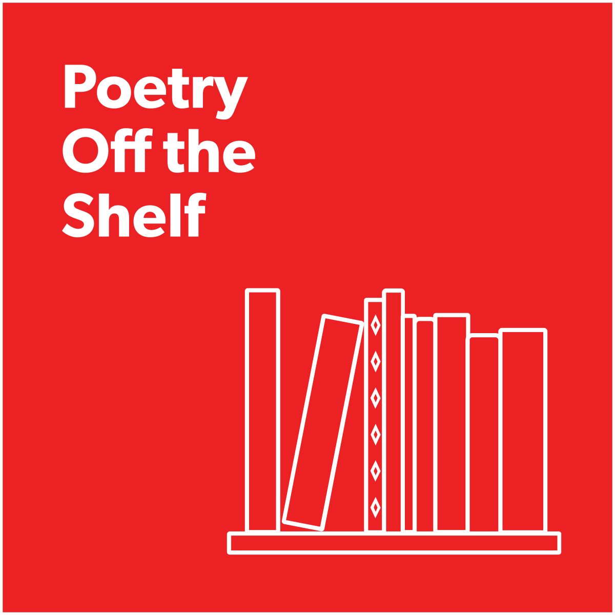
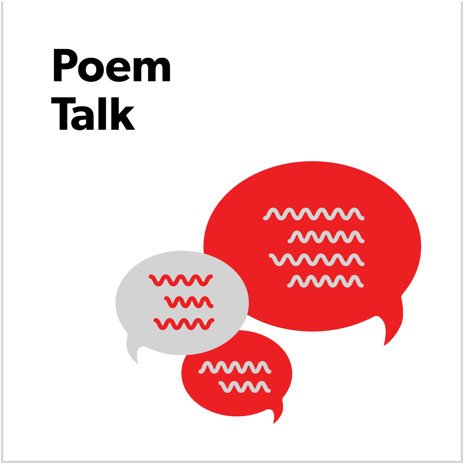
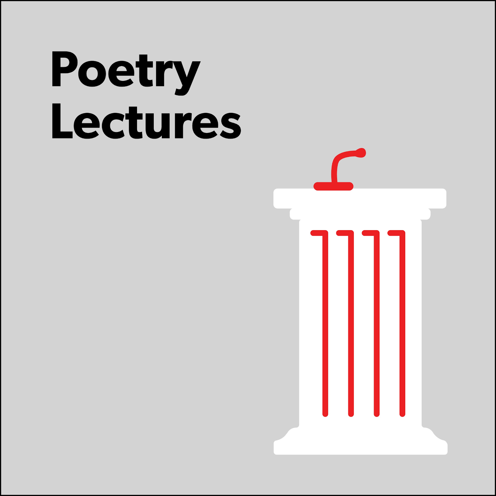
If you’re planning to have more than one podcast, make sure you keep a similar tone in your visual designs, so that your listeners identify all your podcasts with the same brand.
Poetry Foundation podcasts all have the same color palette and similar imagery. It’s always about choosing one core symbol for the podcast artwork and putting the title on the corner of the artwork.
Also, as you’ll notice, Poetry Foundation chooses to keep a sans-serif font. Using sans-serif fonts is a smart move as these fonts are easy to read on phones and computers and fit well with different designs. The font helps the coverworks to look clean and nice even in small pictures.
Looking for Inspiration? Muses are everywhere
Although it is always helpful to take a look at good podcast covers when designing yours, remember to not limit yourself there. On the contrary, when thinking about your podcast art start looking elsewhere and close the podcast directories for a while.
Here are some of the best alternative places to find inspiration for your next artwork:
- Artistic Platforms and Websites: Platforms like Behance, Dribbble, and DeviantArt are treasure troves of artistic talent and creativity. Podcasters can browse through various portfolios and artworks to find styles, color palettes, and compositions that inspire their own cover art.
- Book and Album Covers: The world of book and album cover design offers a wealth of inspiration for podcasters. Analyzing cover designs in different genres can spark ideas for creating compelling and visually striking cover art.
- Art Galleries and Exhibitions: Visiting local art galleries or attending exhibitions can expose podcasters to diverse art styles, techniques, and concepts. Observing physical artworks can evoke emotions and ideas that can be translated into cover art.
- Nature and Landscape Photography: Nature provides a rich palette of colors and textures. Exploring nature photography can inspire cover art concepts that convey the essence of the podcast's content, whether it's about outdoor adventures or environmental topics.
- Film Posters: Film posters often capture the essence of the movie's story and genre. Analyzing film posters can help podcasters understand how visual elements can be used to tell a compelling narrative, which is crucial for cover art design.
- Typography Showcases: Websites and magazines that showcase typography and lettering designs can offer fresh ideas for incorporating text creatively into podcast cover art.
- Historical Photographs: Looking at historical photographs can evoke nostalgia and emotions that can inspire cover art concepts related to history, storytelling, or retro themes.
- Personal Experiences and Hobbies: Drawing inspiration from personal experiences, interests, or hobbies can result in cover art that reflects the podcaster's unique personality and passions.
What to Avoid When Creating Podcast Cover Art
There are several common mistakes that podcast creators should avoid when designing their cover art. Let's explore some key "don'ts" and the reasons behind them:
1) Overcrowding and Clutter
One of the most critical don'ts is overcrowding the cover art with too many elements or information. One technique that can help alleviate both the overcrowding and clutter in your cover art is to remove the image background. This creates more space and makes your critical elements or subjects stand out.
When done correctly, this will give the cover a cleaner look, enabling your potential listeners to instantly grasp the fundamental theme or message. An overcrowded design can overwhelm viewers and make it challenging to grasp the podcast's theme or message at a glance. It's essential to maintain a clean and uncluttered layout to ensure that the central message is conveyed effectively.
2) Irrelevant Imagery
Choosing unrelated or generic images that don't reflect the podcast's content can mislead potential listeners and result in a mismatched audience. The cover art should align with the podcast's genre, theme, and target audience, creating a clear and accurate representation of what the podcast offers.
3) Illegible Typography
Poor choice of fonts or text that blends poorly with the background can make the podcast's title and other details difficult to read. Typography should be legible, well-balanced, and appropriately sized, ensuring that viewers can quickly identify the podcast's name and essential information.
4) Inconsistent Branding
Lack of brand consistency can confuse listeners and diminish the podcast's recognition and recall value. Consistent branding elements, such as color schemes, fonts, and logo usage, should be applied across all episodes and promotional materials to establish a strong and cohesive brand identity.
5) Excessive Effects and Filters
While adding effects and filters can be enticing, overusing them can result in a visually overwhelming or amateurish design. A balanced application of effects ensures that the cover art remains professional and visually appealing.
6) Infringing Copyrighted Material
Using copyrighted images or artwork without permission can lead to legal issues and damage the podcast's reputation. Creators should ensure they have the right to use all elements in their cover art or opt for original and royalty-free content.
7) Poor Color Choices
Selecting colors haphazardly or without considering their psychological impact can lead to unintended associations and feelings. The color palette should align with the podcast's tone and content, evoking the right emotions in the target audience.
8) Lack of Focus on Podcast Title
The podcast's title should be prominently featured and easily readable. Avoid burying it amidst other design elements, as it is the primary identifier for potential listeners.
9) Ignoring Platform Specifications
Different podcast directories and platforms have specific size and formatting requirements for cover art. Ignoring these specifications might result in distorted or cropped artwork, reducing its visual impact.
10) Using Unrelated Stock Art
While stock images can be convenient, using generic or unrelated stock art may not effectively represent the podcast's uniqueness. Customized artwork or illustrations that are tailored to the podcast's theme can be more impactful.
11) Ignoring Mobile Compatibility
With an increasing number of listeners accessing podcasts on mobile devices, cover art should be designed with mobile compatibility in mind. Avoid using tiny text or intricate details that may be difficult to discern on smaller screens.
12) Copying Other Podcasts
Creating cover art that closely resembles another popular podcast's design can lead to confusion and dilute the podcast's individuality. Originality is crucial for standing out in a saturated podcast market.
The Psychology of Colors: How Hues Influence Listener Perception
As we’ve already mentioned, the use of colors in podcast cover art goes beyond mere aesthetics; it delves into the realm of psychology, where the hues chosen can significantly influence listener perception and emotional response.
The human brain is wired to interpret colors and attach certain meanings and emotions to them, which can subconsciously affect how a podcast is perceived and received by potential listeners.
So here is a color psychology cheat sheet for you to have at hand when choosing your main podcast cover art colors.
1) Red: Passion and Energy
The color red is often associated with passion, energy, and urgency. When used in podcast cover art, it can evoke a sense of excitement and intensity, making it suitable for podcasts with thrilling or action-packed content. However, excessive use of red may also convey a warning sign or aggression, so it should be used strategically to emphasize specific elements of the artwork.
2) Blue: Trust and Calmness
Blue is known for its calming and trustworthy qualities. Podcasts that aim to build a sense of reliability or focus on informative and educational content can benefit from using blue in their cover art. This color is often favored by businesses and brands that want to establish a sense of authority and credibility, making it a suitable choice for podcasts in the same vein.
3) Green: Nature and Growth
Symbolizing nature, growth, and renewal, green can be a great choice for podcasts related to health, wellness, and sustainability. It creates a sense of harmony and balance, making it an ideal option for content that seeks to connect with listeners on a deeper and more organic level.
4) Yellow: Optimism and Happiness
Yellow radiates warmth, optimism, and happiness. It can be an excellent option for podcasts that focus on positive thinking, self-improvement, or comedy. However, too much yellow can be overwhelming, so it's crucial to balance it with other colors to create a harmonious visual effect.
5) Purple: Creativity and Luxury
Purple is often associated with creativity, mystery, and luxury. For podcasts with artistic, imaginative, or sophisticated content, using purple in the cover art can help communicate the essence of the show and attract listeners who appreciate a touch of elegance.
6) Orange: Energy and Enthusiasm
With a combination of the passion of red and the cheerfulness of yellow, orange exudes energy and enthusiasm. It can be an excellent choice for podcasts that are motivational, adventurous, or have an element of fun and excitement.
7) Black: Authority and Sophistication
Black conveys authority, sophistication, and a sense of mystery. While it can make cover art look sleek and elegant, too much black may also appear gloomy or heavy. It is best used in combination with other colors to create a balanced and compelling visual impact.
8) White: Purity and Simplicity
White represents purity, simplicity, and cleanliness. It can be an effective background color that highlights other design elements. Podcasts aiming for a minimalist or modern aesthetic might consider incorporating white into their cover art.
How to Make Podcast Cover Art
So what are the exact steps for making a podcast cover art? We’ve summed up all of it in this section. Here's a step-by-step guide to help you create captivating cover art that represents your podcast effectively:
- Define Your Podcast's Identity: Before diving into the design process, clearly define your podcast's identity, including its genre, tone, and target audience. Understanding these aspects will guide your design choices.
- Gather Inspiration: Look for inspiration beyond podcast cover art. Explore artwork, photography, graphic design, and even unrelated sources like books and nature. Inspiration can spark unique ideas for your cover art.
- Choose a Design Tool: Depending on your design skills, choose a suitable design tool. Options range from professional software like Adobe Photoshop and Illustrator to user-friendly online platforms like Canva.
- Start with Dimensions: Most podcast directories have specific cover art dimensions. Use these dimensions as a starting point to ensure your cover art fits perfectly on various platforms.
- Select Imagery: Choose an image or illustration that encapsulates your podcast's theme. If using stock images, ensure they are relevant and high-quality. Use vector images when possible as they are easy to edit and scale. For example, if your podcast is about travel, you can use a map of the USA and highlight certain locations with custom graphics like flags. And of course, if you're artistically inclined, consider creating custom illustrations.
- Color Palette: Refer to the color psychology section to choose colors that align with your podcast's content and emotions. Aim for a harmonious and balanced color palette.
- Typography: Select fonts that match your podcast's personality. Pay attention to readability and ensure fonts complement each other. Your podcast's title should be easily legible, even in smaller sizes.
- Layout and Composition: Experiment with different layouts and compositions. Place essential elements strategically to guide the viewer's eye and create a balanced design.
- Create Contrast: Ensure text stands out against the background. Use color contrast and font size variation to enhance readability.
- Incorporate Branding: If you have a podcast logo or brand elements, incorporate them into the cover art to reinforce your podcast's identity.
How to Create a Podcast Logo
If you don’t have a logo, here is how to make one quickly. First of all, keep in mind that creating a logo for your podcast involves capturing the essence of your show and conveying it visually. Start by brainstorming ideas and concepts that represent the theme, tone, or subject matter of your podcast. Consider elements such as symbols, typography, and colors that align with your podcast's identity. Once done, you can use a couple of online logo making tools to easily create your logo design.
Here are some of our favorites:
- Free Logo Maker ZillionDesigns also offers a great logo design tool. There are tons of templates available and completely free.
- Logo Creator Logo editors are great if you have some design background and know what you are aiming for. Many of them offer low cost or free packages.
- Name Generator A podcast is only as good as its name. Use an AI name generator to come up with a variety of ideas and domain names free of charge.
When creating your logo, make sure to keep a few things in mind:
- Review Mobile Compatibility: Test your design on mobile devices to ensure it looks appealing and remains easily readable on smaller screens.
- Simplify and Edit: Less is often more. Eliminate unnecessary elements and simplify your design to maintain a clean and focused look.
- Seek Feedback: Share your design with others to gather feedback. Consider input from your target audience to ensure your cover art resonates with potential listeners. Based on feedback, make necessary adjustments to refine your cover art. Iterate until you achieve a design that effectively communicates your podcast's essence.
- Finalize and Export: Once you're satisfied with your design, save it in the appropriate file format and resolution. Ensure the final cover art meets platform specifications. Before publishing, test your cover art on various devices and platforms to confirm its visual appeal and legibility.
- Upload and Monitor: Upload your cover art to podcast directories and platforms. Regularly monitor its performance and consider updating it to keep it fresh and relevant.
Final Thoughts
Remember that creating podcast cover art is an iterative process. Don't hesitate to experiment with different design elements and gather feedback from peers or potential listeners. By combining your podcast's identity with creative design principles, you can produce eye-catching cover art that entices potential listeners and effectively represents your podcast's content and style.


