Let’s be honest: scrolling through YouTube can be an overwhelming experience.
You open the homepage and are immediately met with a collection of videos, all screaming for your attention. While you may glance at the title of the videos, the first thing you see is the thumbnails, each carefully designed by the video’s creator to get you to click on their creation.
But many YouTube thumbnails don’t so much as miss the mark but crash-land in an entirely different universe.
Join us as we look at some of the worst YouTube thumbnails and break down how to avoid making the same mistakes. Let’s dive in.
The worst thumbnails ever… and how to fix them
Problem #1: When clickbait goes wrong
Clickbait isn’t anything new on YouTube, but some creators are quite egregious with their clickbait use. Here’s an example:
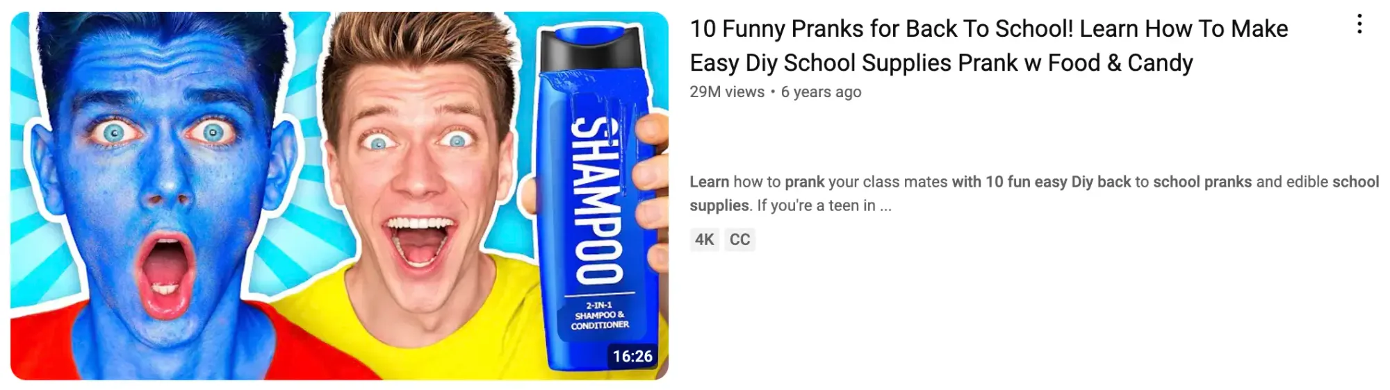
Why it fails. Sure, clickbait thumbnails do what they say on the tin and drive clicks (plus, a little bit of clickbait here and there never hurt anybody.) But misleading viewers excessively is a quick way to tank not only audience trust but your channel's performance, as YouTube’s algorithm notices when people bounce quickly from a video.
How to fix it. There’s a difference between a tantalizing YouTube thumbnail that creates curiosity and a true bait-n-switch. Instead of exaggerating your video’s content or downright lying to get clicks, use an intriguing image that represents what’s in the video and highlights the most interesting part.
Problem #2: Information overload
When thumbnails are stuffed with too much text, tons of images, and clashing colors, you’re left with a chaotic mess that creates more headaches than good impressions.
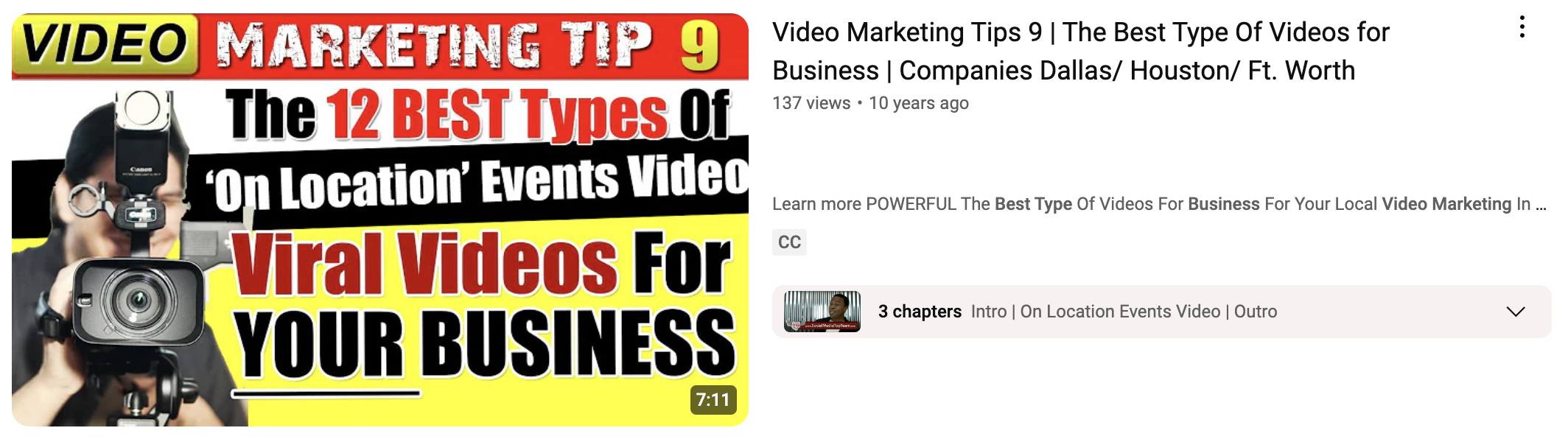
Why it fails. You only have a couple of seconds to grab your audience’s attention. In this example, the key message gets lost in the clutter, and most people will scroll on without reading the whole title. Plus, trying to cram so much into a small space (with multiple fonts to boot) simply doesn’t look very good.
How to fix it. Text has its place on a thumbnail, but it should be used sparingly. People can read around six words in a single glance, so keep captions short and to the point, including only what you need to convey your message.
Problem #3: AI-generated thumbnails
AI is incredible. But if you’re going to use AI tools to support your content creation work, it’s important you make sure that it isn’t so obvious.
Here’s an example of an AI-generated thumbnail that looks OK at first glance but, on closer inspection, is… Questionable.
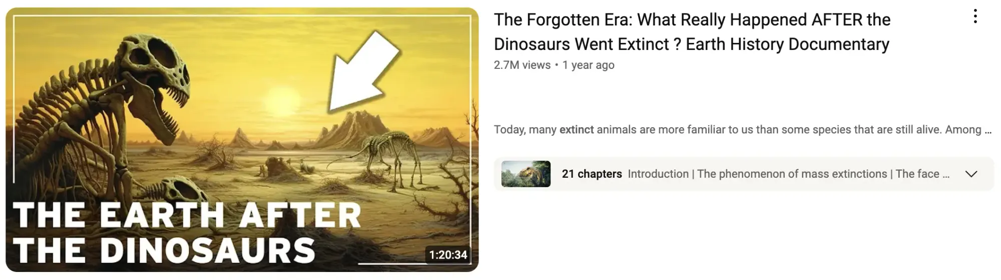
Why it fails. Can you spot the two dead giveaways that this thumbnail was AI-generated? Let us clue you in:
- The ‘big arrow’ is a powerful weapon in a YouTuber’s arsenal, but it actually has to serve a purpose. So, what exactly is the arrow here pointing at?
- The second dinosaur skeleton has a few too many legs and no head.
How to fix it. This thumbnail would be 10x better without the arrow. Not only because it isn’t pointing towards anything specific but also because it draws attention to errors in the image. If you choose to generate your thumbnails with AI, take the time to edit out any mistakes.
Problem #4: Boring your audience
Some thumbnails are just plain dull. This can look like featuring a graining image, lacking a context-providing caption, or failing to align with the video's context. While these aren’t as offensive as misleading thumbnails, they’re still not doing your video any favors.
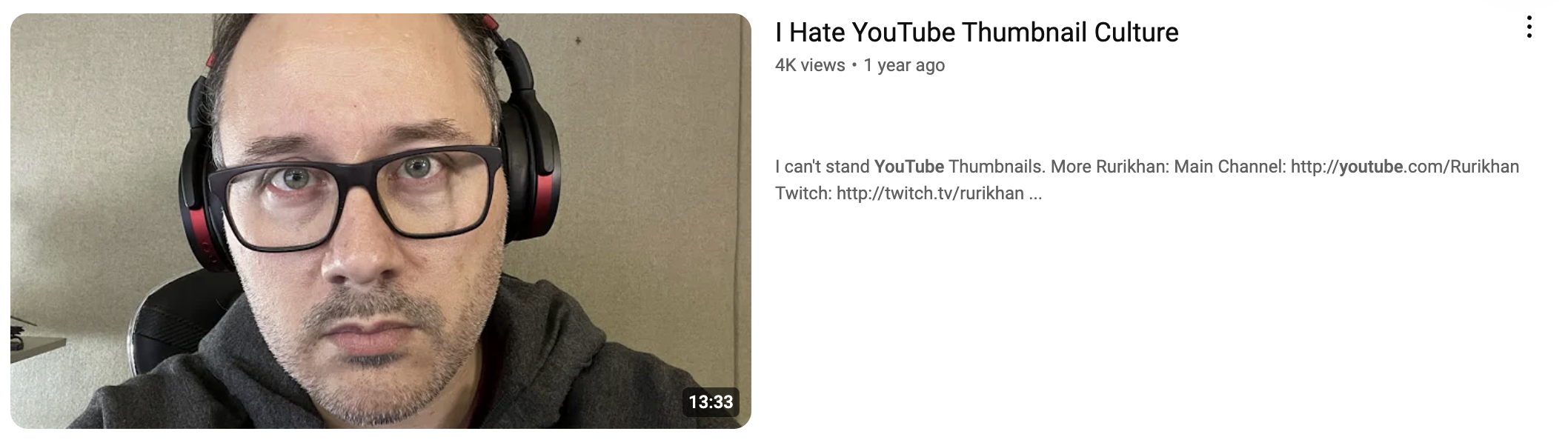
Why it fails. As we’ve mentioned, you only have a couple of seconds to grab the viewer's attention. A blurry snap of your face simply won’t stand out in a sea of vibrant colors and snappy headlines.
How to fix it. Good thumbnails don’t need to be overly complicated. You can still use a still from your video as the base for your thumbnail while adding visual intrigue with a caption in bold text.
How to create a good YouTube thumbnail
Thumbnails are like the cover of a book; if your thumbnail is bad, chances are people won’t even bother clicking on your content. As your thumbnails are key to building trust with your audience, boosting click-through rates, and ultimately growing your channel, every up-and-coming YouTuber must master the art of thumbnail creation.
Here are some practical tips for creating click-worthy thumbnails every time.
– Be honest. Make sure your thumbnail accurately represents your video’s content.
– Keep it simple. Avoid clutter by focusing on one or two key elements.
– Use good images. Ensure your images are not only relevant to the video’s content but are high-quality. Pixelated images are a big no-no.
– Make text readable. Make sure your text is easy to read, even on smaller screens, and is legible against the background.
– Optimize, optimize, optimize. You won’t get it perfect the first time, and that’s OK. The key to long-term success is to refine your approach over time based on what works for your audience. So, don’t be afraid to experiment — just make sure you pay close attention to your analytics.