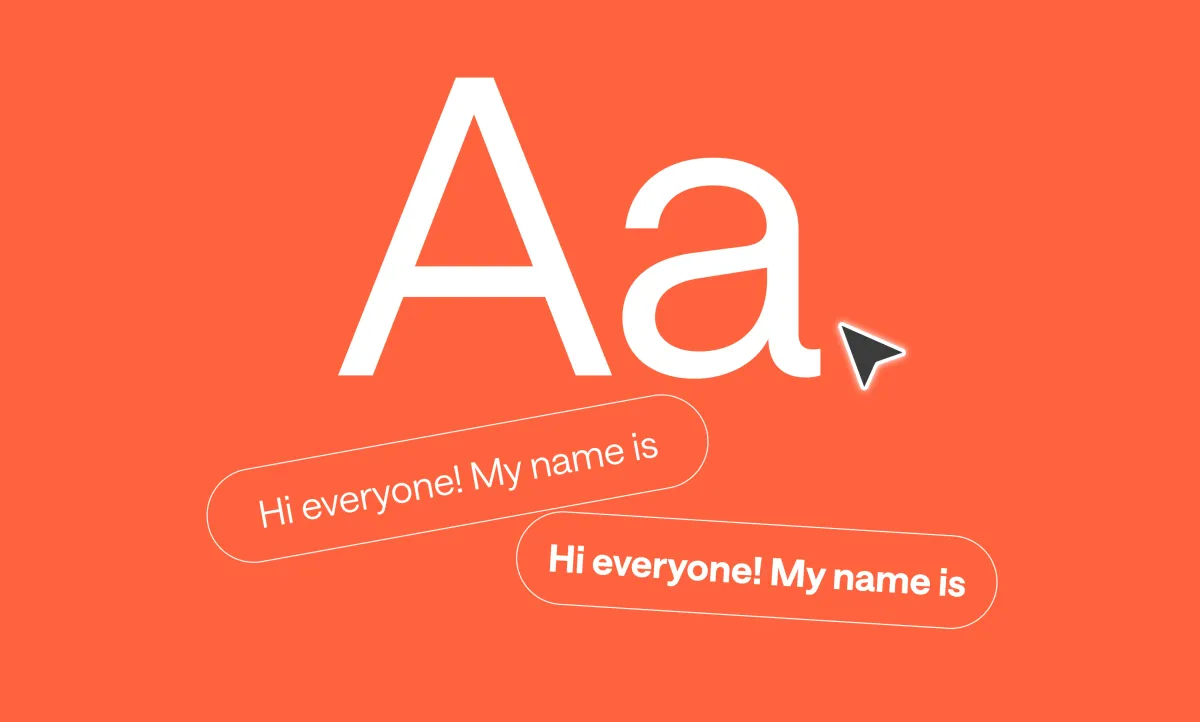
When people watch your video, the captions need to do two things at once. They have to be readable on any screen, but they also need to fit the personality of your content. A caption for a quick TikTok skit shouldn’t look the same as one for a documentary clip or a tutorial. The font is part of the experience, and picking the right one helps keep viewers locked in.
Best fonts for subtitles and captions worth trying
These are the styles that tend to work best, along with the kinds of videos where each one makes sense.
1. Fun fonts

When you’re making vlogs, lifestyle videos, or anything that feels conversational, you want captions that are clear without looking stiff. Aim for a natural, down-to-earth vibe.
For vlogs, captions should feel like they’re part of the moment. Pick a font that doesn’t distract from faces and keeps its legibility against moving backgrounds. A good tip is to add a subtle outline or shadow so the text stays readable no matter the lighting in your video.
2. Bold fonts
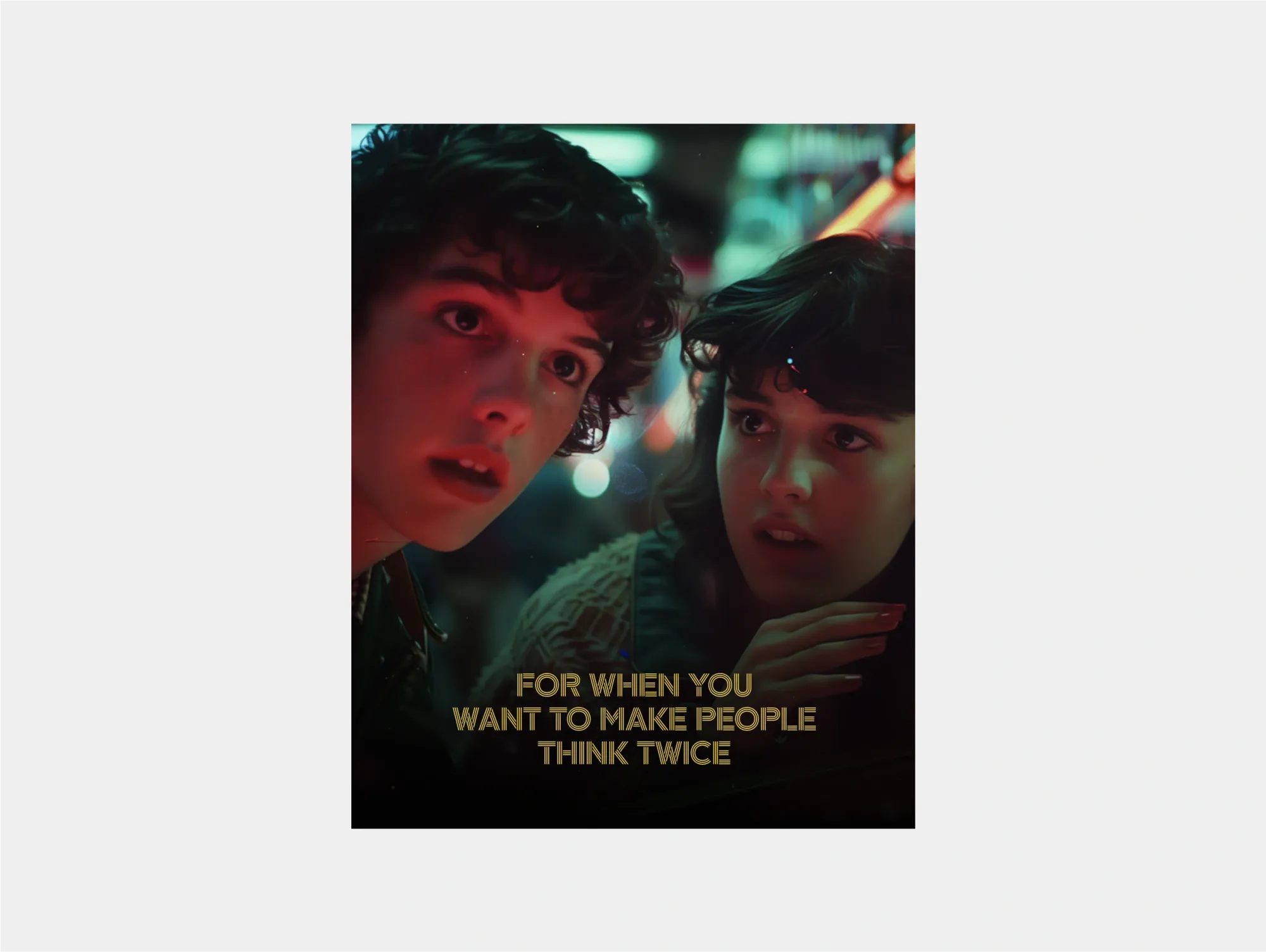
Bold fonts are built to stand out. They’re a top choice for creators posting to TikTok, Instagram Reels, or YouTube Shorts where videos move quickly and audiences scroll even faster. A heavier font weight ensures captions pop off the screen, even against chaotic visuals.
The tradeoff is subtlety. Bold fonts aren’t always ideal for longer-form videos where viewers might find them overpowering. Use them for punchy edits, fast dialogue, or call-outs where you want people to instantly notice what’s being said.
3. Dramatic fonts

Cinematic or mystery-driven content benefits from fonts that add atmosphere. Gothic-inspired fonts can complement a darker tone and make subtitles feel more like part of the storytelling.
This style is perfect for true crime, horror, or narrative-driven videos where captions carry the same weight as visuals. Just remember: readability always comes first. Avoid fonts that are too ornate or decorative, and test on mobile to make sure your audience can still follow every word.
3. Magical fonts
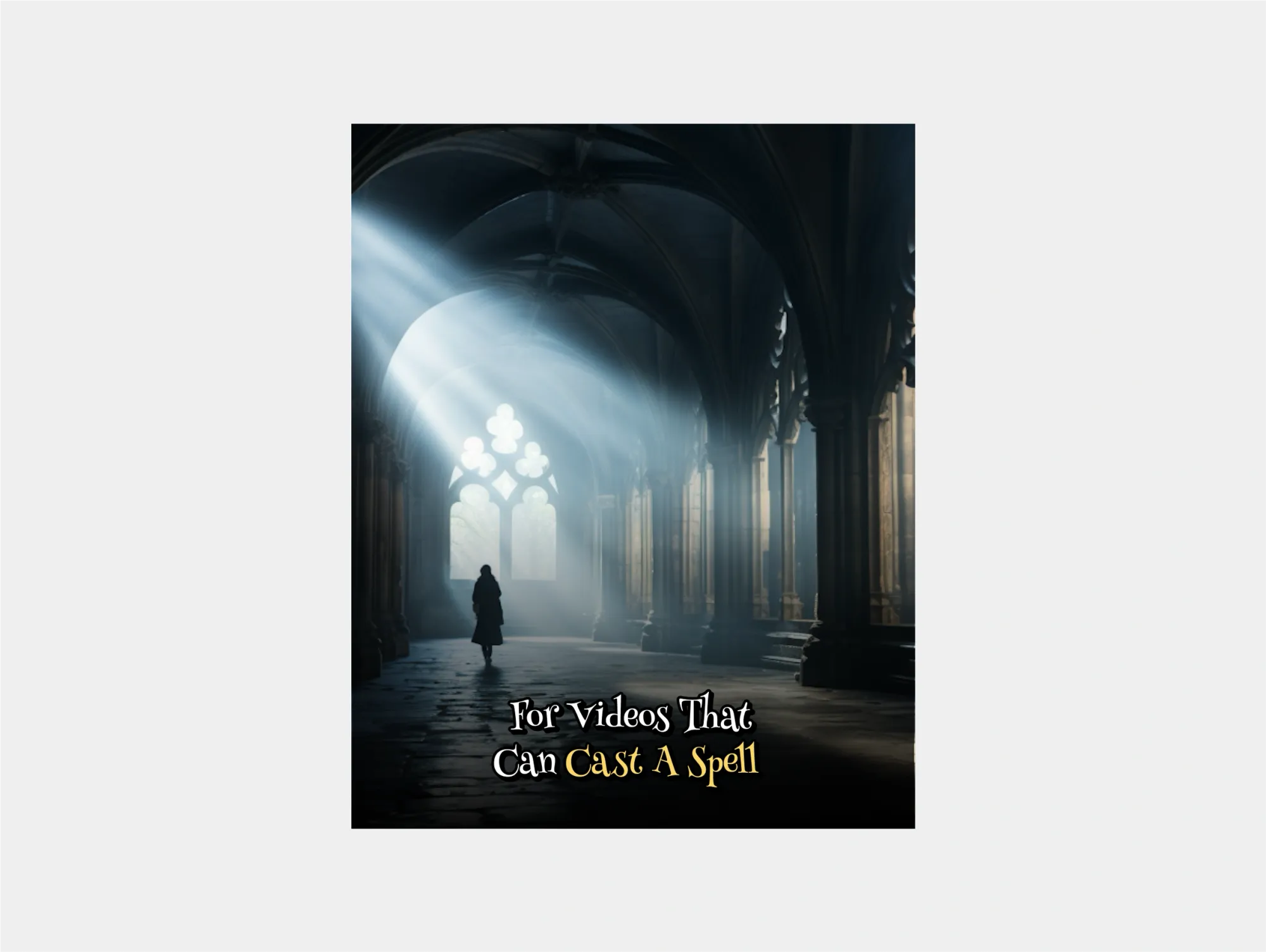
For videos that lean into grandeur (travel reels, fantasy edits, or artistic films) a cinematic font elevates the experience. These fonts often have sharp edges or high contrast, which gives them a dramatic quality.
They work well when captions are part of the visual design rather than just functional text. That said, balance is key. If you go too heavy on stylization, viewers may end up struggling to read. Pair cinematic fonts with high-contrast backgrounds or outlines to make sure they look polished on every screen.
4. Energetic fonts

Some videos need captions that match their intensity. Strong, condensed fonts can create a sense of urgency and keep people hooked. They’re a smart choice for trailers, suspenseful storytelling, or content with quick cuts and rising tension.
These fonts thrive when timing is everything. If your captions sync perfectly with the rhythm of your edit, the font will feel like part of the pacing. Just avoid using them for laid-back or comedic content, where they may feel out of place.
5. Playful fonts

Playful fonts make sense when your content is lighthearted or fun. They work best in comedy, kids’ videos, lifestyle content, or clips where personality is the main draw. Fonts in this category are often more rounded or colorful, giving captions a casual energy.
The key is to balance fun with readability. A playful font that’s too quirky can quickly become hard to read, especially on a phone. Keep it simple enough that your audience gets the point instantly, but let the style add a bit of flavor to match your tone.
6. Soft fonts
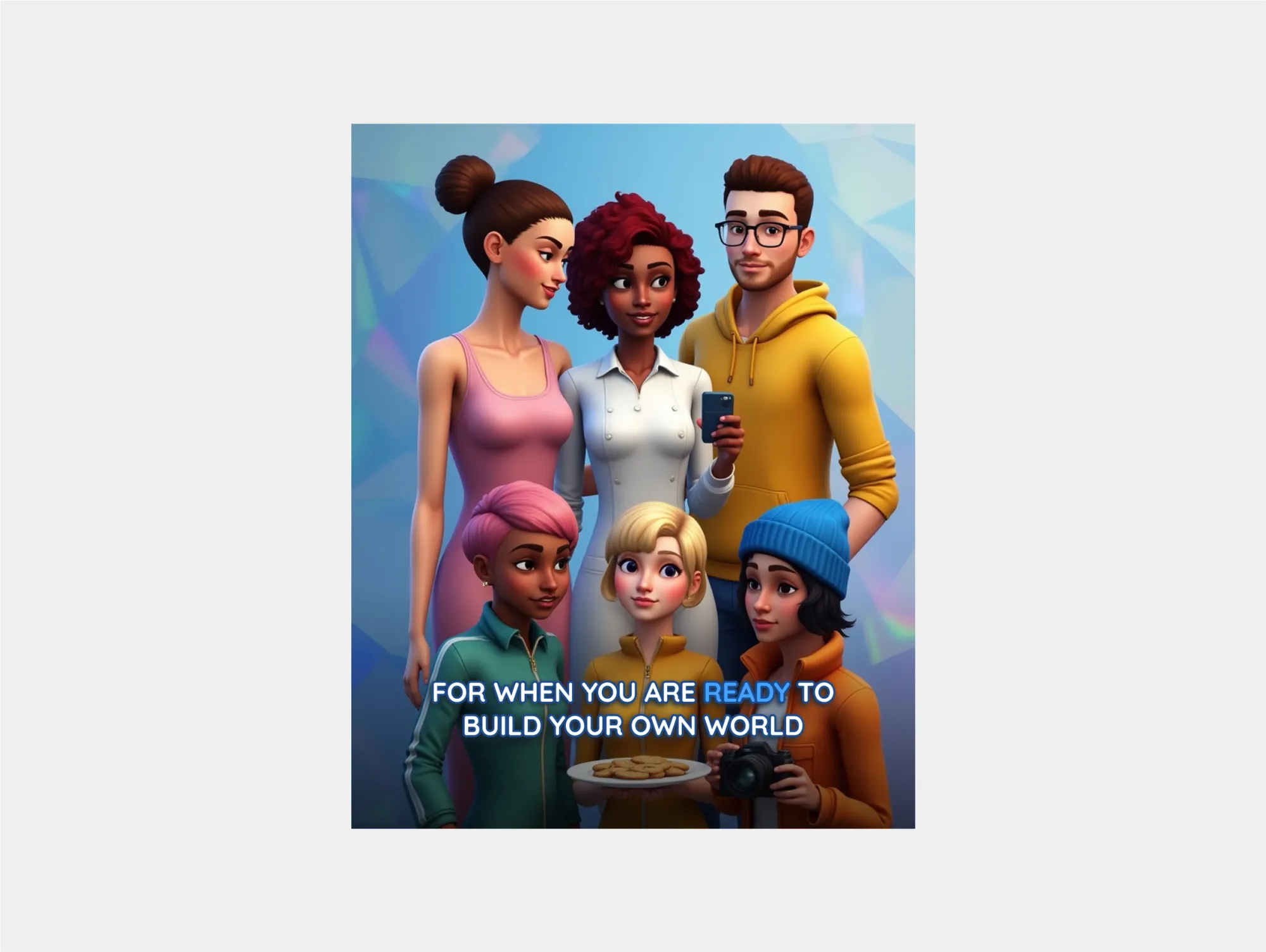
Modern fonts are versatile and work across a wide range of content, from animations and gaming to DIY tutorials. Their clean lines and minimalist design make them easy to read without feeling bland.
These fonts are also great for branding consistency. If your video style leans fresh, innovative, or futuristic, a modern subtitle font will keep the whole look cohesive. They’re especially useful when you’re building a channel identity and want your captions to feel like part of that design.
How to add captions to videos
If you want the fastest way to create clean, professional captions, Podcastle makes it easy. With our automatic subtitle generator, you can create captions in minutes and place them anywhere in your video. It’s the simplest method if you want accuracy and style without spending hours editing.
1. Upload your video
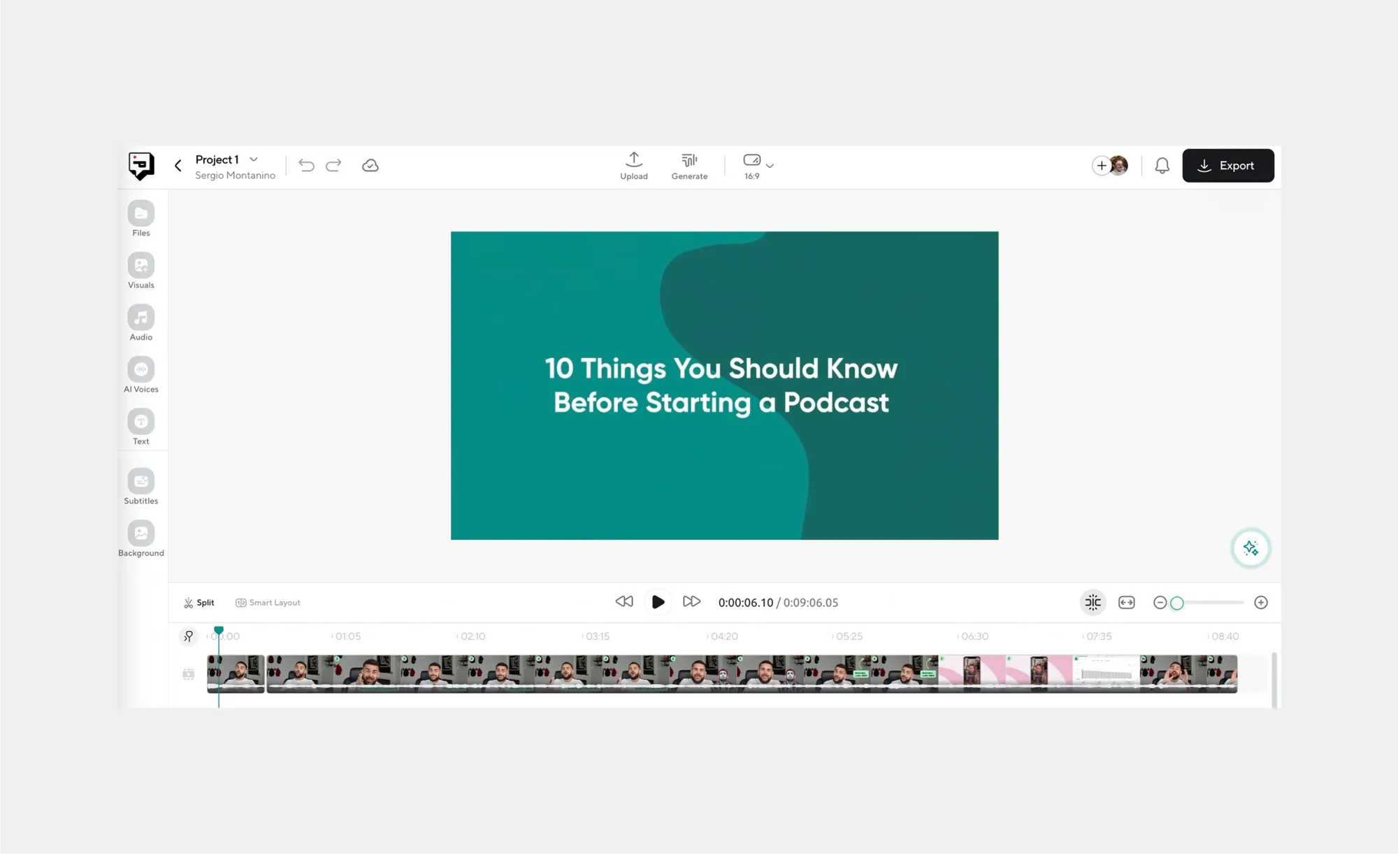
Drag and drop your video into Podcastle. It all works in your browser, so you don’t need to install anything or deal with complicated setup.
2. Generate your captions
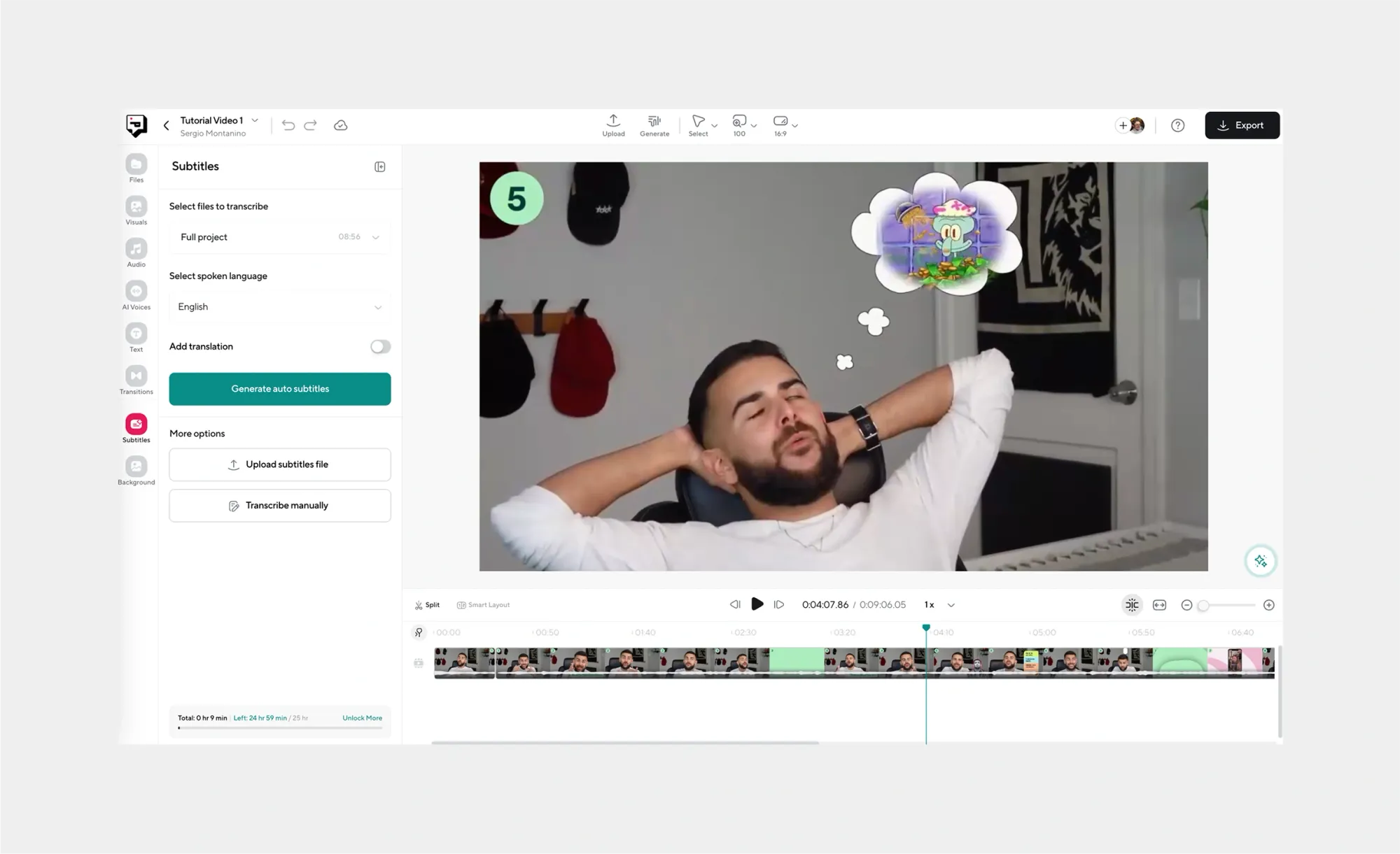
Use our automatic subtitle generator to turn your audio into captions instantly. This saves you from the long, manual process of typing everything out line by line.
3. Pick your caption font
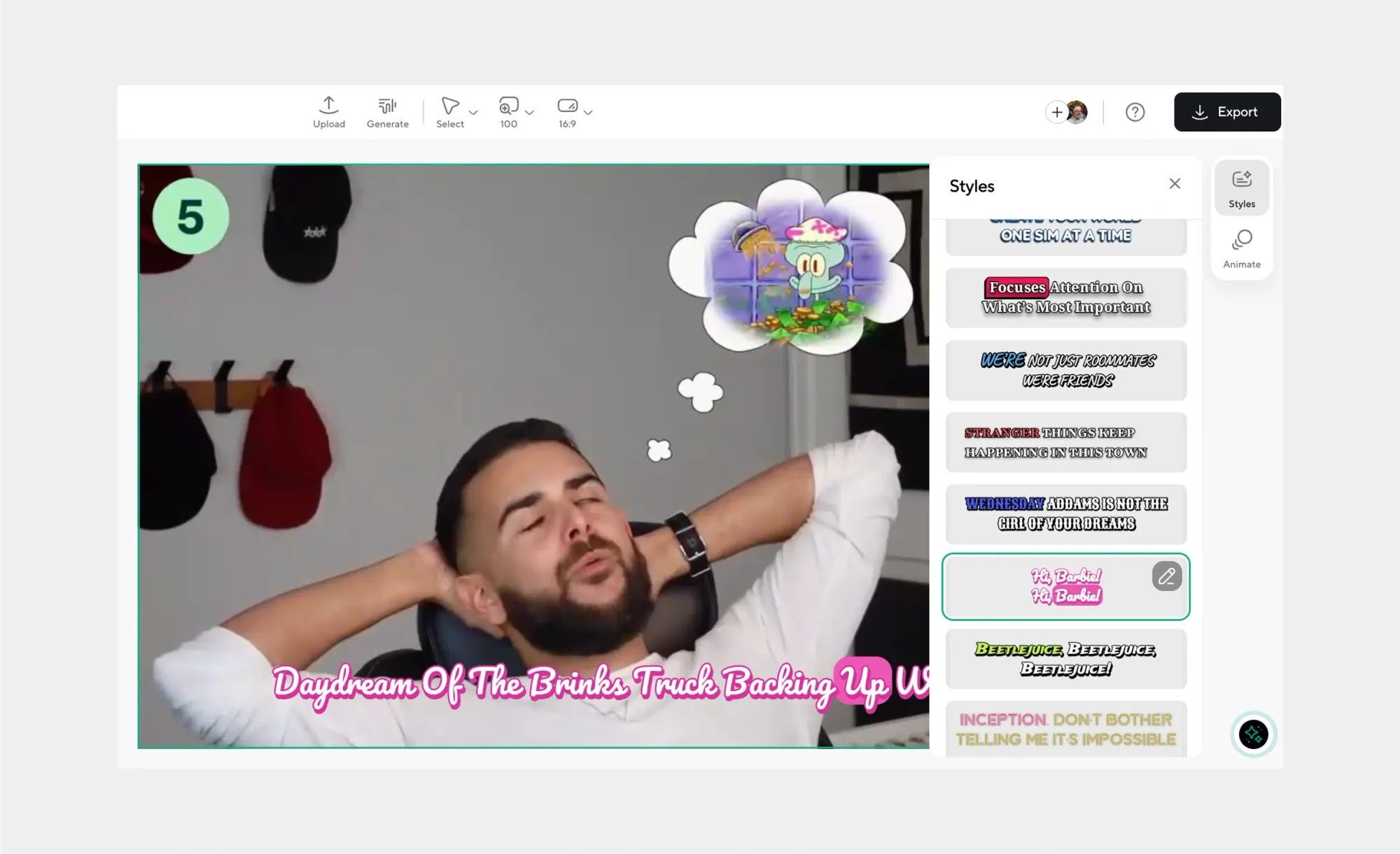
Choose a font and style that fits your video. It all depends on the vibe you're going for, but clear, legible text is always the safest choice, especially for viewers watching on smaller screens.
4. Make any final edits

With Podcastle, you can benefit from a handful of one-click AI enhancements and editing features, along with AI voices, transitions, and other visual and sound assets to use for your videos. Edit as needed and make sure every detail makes sense!
5. Export your captioned video

When you’re happy with the results, export your video. You’ll have captions synced and styled exactly how you want, ready to upload to YouTube, social media, or anywhere else.
Caption tips worth keeping in mind
- Keep them readable. Choose fonts that are simple and easy to follow on any screen. High-contrast colors with a slight shadow or outline work best so your text doesn’t get lost against bright or moving backgrounds.
- Check accuracy. Automatic caption generators are fast, but they’re not flawless. Always review your captions for typos, misheard words, or awkward timing. Even small errors can distract viewers.
- Match the tone. Your captions should fit the style of your video. Playful content can use a more relaxed font, while professional or educational videos usually benefit from clean, neutral styles.
- Think about timing. A caption that flashes too quickly is just as frustrating as one that lingers too long. Aim for one to two lines on screen at a time, displayed long enough to read comfortably.
- Consider accessibility. Captions aren’t only for viewers who can’t hear, they also help anyone watching without sound. Well-timed captions make your video easier to enjoy for everyone.
Create captions with Podcastle
Adding captions doesn’t have to be complicated. With Podcastle, you can upload your video, generate captions instantly with our automatic subtitle generator, and place them anywhere on screen. From there, you can polish the entire video without leaving the platform.
Here’s what else you can do with Podcastle's AI video editor:
- AI voices – Choose from over 1000 natural-sounding voices or clone your own for narration.
- AI video editing – Enhance your footage automatically and clean up rough spots with one click.
- Background removal and replacement – Swap out backgrounds or create new settings without extra tools.
- Royalty-free music and sound effects – Add professional audio tracks that fit your video’s mood.
- Transitions and effects – Smoothly connect scenes and give your content a polished, professional flow.
With everything in one place, Podcastle saves you from juggling multiple apps and helps you publish videos faster.
