That’s the right question you ask!
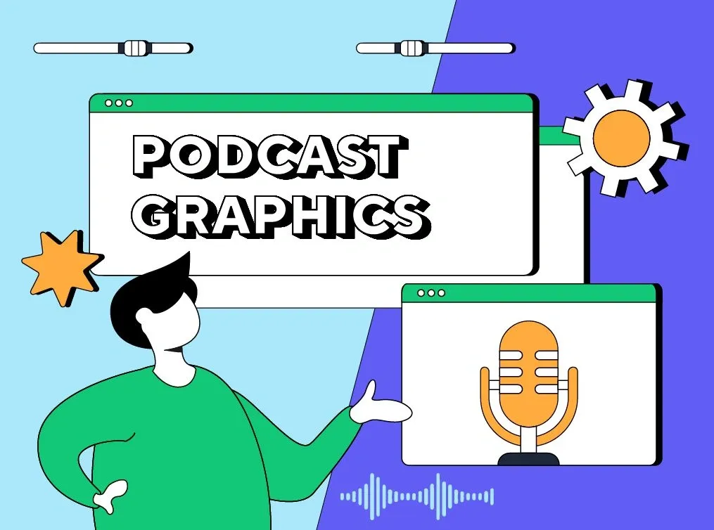
We live in virtual/visual reality, and even if you focus on creating audio content, having a beautiful visual wrap-up for it is a must.
Before you choose podcast graphics for your shows, you should consider two important factors: the style that you and your podcasts have and the style dictated by modern tendencies of the time.
Let’s skim through both aspects.
What are the main visuals you should have for your podcast?
Before planning the style, colors, and other components of your podcast graphics, it’s essential to understand what visuals you need.
The majority of starting podcasters think that the only visual they need is the thumbnail for the podcast episode. However, although podcast thumbnails play a significant role, it’s not the sole design element you should concentrate on.
Depending on where you want to post your podcast and have the podcasting channel, the required quantity of podcast covers might vary.
To understand this better, let’s take parallels with your social media accounts. On Facebook or Instagram, you have a large cover photo to showcase all of your content; however, on Discord, you only have a small circle frame that shows your profile picture and discord icons. This is why most people choose to create different images for each channel.
The same works for podcasts, and below, you can read what visual materials you will most probably need to have for your podcasting account.
Show cover
You can see below how show covers look at Apple Podcasts.
The cover has a square shape and should have 3000×3000 pixels. You put it as a general thumbnail for your show. Depending on your chosen directory, the functions of “play,” “pause,” and others might appear on the upper or lower part of the cover. Therefore, try to concentrate the main part of your visual on the center so that the mentioned buttons do not spoil your desired visual effect.
Channel icon
Podcast channel icons are similar to Youtube channel icons. That’s the image presented in a small circle frame near your channel name. It’s essential to design a visual for that part, which will be visible enough for its small size. Also, it should be inviting and trigger interest for potential listeners to click and check the podcasts.
You are encouraged to have the channel icon in 3000×3000 pixels and centralized. Here, you should have more safe zones from each side of the visual, as it shouldn’t be distorted because of being cropped in the circle.
Cover for each episode
You can have the thumbnail for each separate episode or have a general show cover for all of your episodes. You can also have different episode covers for a particular bunch of podcasts. For example, you can have a Christmas episode thumbnail for December’s podcasts, then change the design for other podcast seasons or collections.
Many podcasters do not go into details so much and do not have separate episode covers at all. However, doing so is very encouraged, as it refreshes your listeners’ impressions of you. Also, it looks more dynamic and shows the efforts you continuously put into your channel.
Here is how the podcasting channel of Beyond the to-do list keeps the same cover for all episodes.
Here is how the podcasting channel Risk Show organized different covers for each episode.
Promotion or subscription banners
Usually, you want to highlight the subscription banners or promoted podcasts among the other regular podcast episodes you post. The visuals for the mentioned podcasts should perform as triggers for your listeners to take additional steps: subscribe to your channel, buy premium podcasts, subscribe to a free channel, etc.
That’s why you might consider developing unique covers for promotional podcasts, which will have a difference in style and a call to action.
Should you have different designs for each podcast graphic?
Right now, simply designing one general thumbnail for all your podcasts might seem complicated. Practically you have two choices of organizing your podcast graphics. You can either use the same visual with adjusted sizes for different sections or develop separate designs for each.
While customized designs usually perform better, you should ensure your listeners do not lose the clue and identify your podcasting brand no matter which visuals they see. In this regard, it’s better to develop the general design guideline, which will be the same for all your visuals, and later add new elements or modify it a bit for different graphics.
If you are going to develop your podcasts not only in podcast directories but also in social media accounts, you should consider developing visual branding for those platforms as well. For example, if you are going to have an Instagram blog about your podcasting channel, you can’t use only podcast covers. It should be a combination of personal photos and podcast graphics, inspired by the same predeveloped design guidelines.
Here is how one of the most popular podcasters in the US does it.
She actively uses her podcasts’ branded purple color while her feed is also filled with her and her dog’s photos and videos. Social media is a powerful platform for driving traffic to your podcasts. That’s why it’s essential to make its visual part so that your listeners can quickly identify your connection to your podcasting channel.
How can I develop podcast graphics?
There are two primary options for that.
- You can come up with the idea of how you want your podcast graphics to be. Later, you can communicate it to a graphic designer who can help you with the technical implementation of your idea. Graphic designers are also a good idea as they can help you come up with fresh ideas if it’s hard for you to decide for yourself. Here is our advice on what you should consider for podcast cover art.
- You can download and use ready podcast graphics. For example, you can find different podcast templates at Etsy starting from as low as $1,45 per package. You can also find icons related to Podcasting at Envato Market for $3.